Pecora Nera is a fair trade cooperative that sells artisanal products. It has a centrally located store in Piacenza that is very popular. However, the website is old and out of date and has very little traffic. It is also difficult to navigate.
I was in charge, together with my university colleagues, of revamping the entire Brand Identity and graphic appearance of the website.
Website analysis
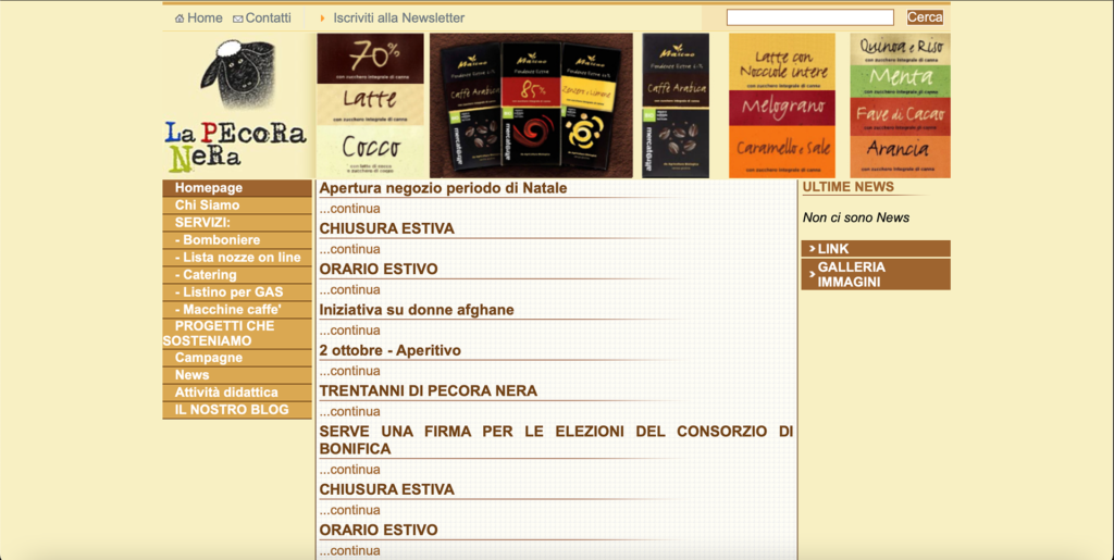
The first step in order to craft a new website experience, was to analize its pain points. The most important was the bad content organization: navigating the website was challenging because the information was difficult to find.
Other minor but not insignificant problems were a weak and underdeveloped Brand Identity, page structure that was not very dynamic and eye-catching, and content that was verbose and difficult to navigate.
Original website
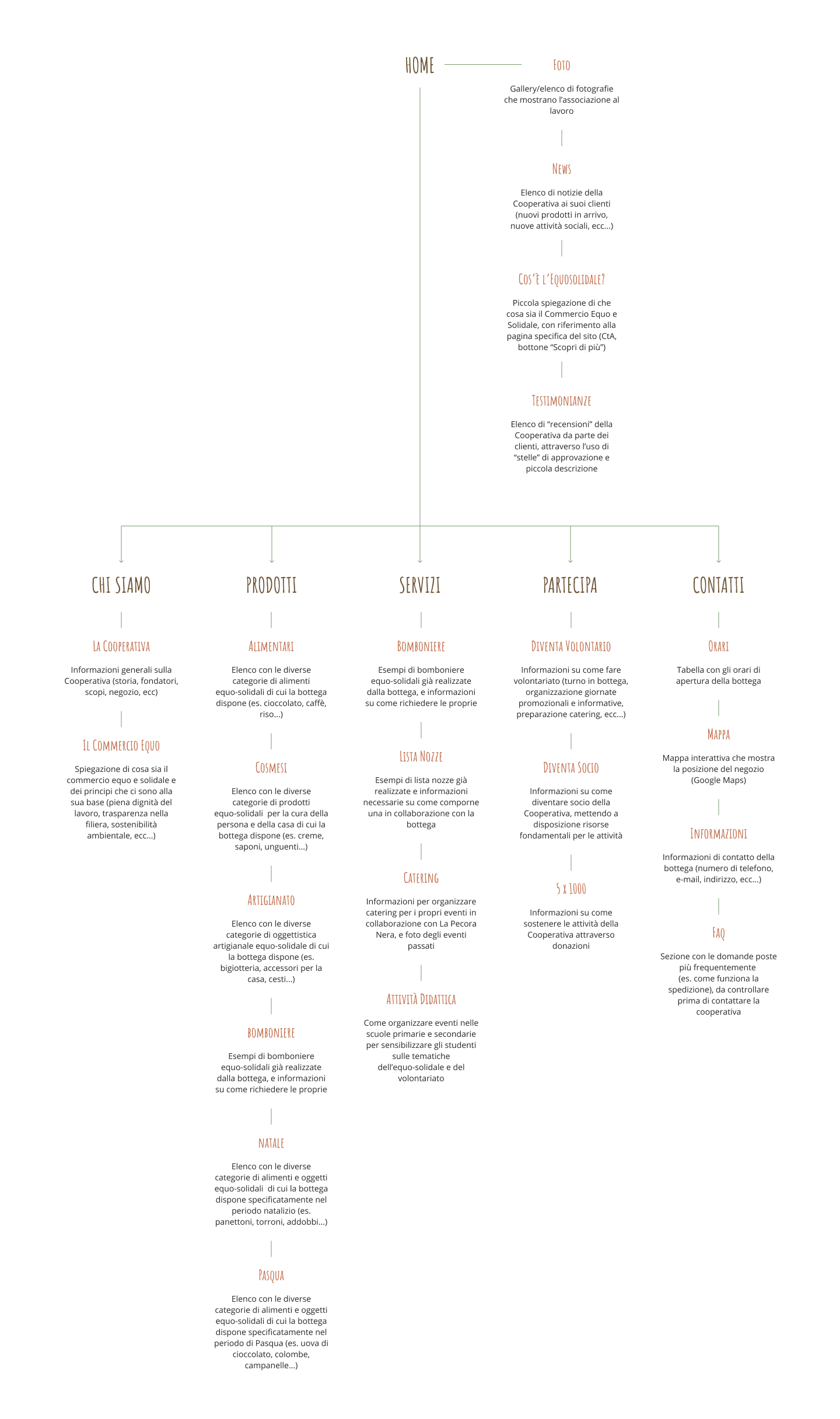
Information Architecture
After analyzing the pain points of the website we designed a better content organization that was easy and straightforward to understand.
New website structure (click to expand)
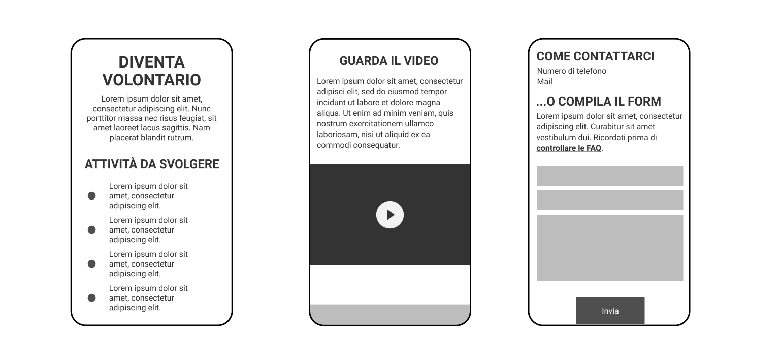
Wireframing
With the definition of the website organization we began to design the pages’ layout through low fidelity wireframes. We used a mobile first approach.
Low fidelity wireframes of the main pages (swipe to see more).
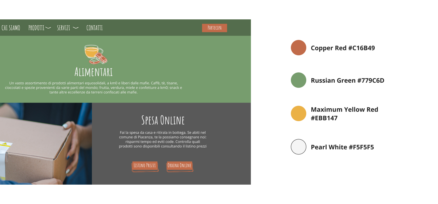
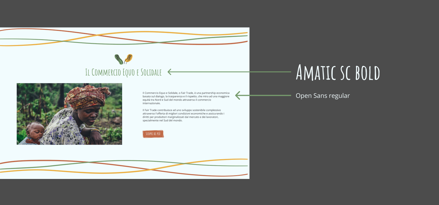
Developing the
brand identity
During the design of the layout we developed the new visual identity of Pecora Nera: we designed a logo, chose a colour palette, typography and disctintive elements, such as illustrations and icons, that helped in creating an uniform brand identity that conveys a handcrafted and handmade feel.